Automated Data Plotter
This application dynamically generates many types of graphs derived from various IEM data sources. Feel free to use these generated graphics in whatever way you wish.
1 Select a Chart Type
2 Configure Chart Options
Plot Description:
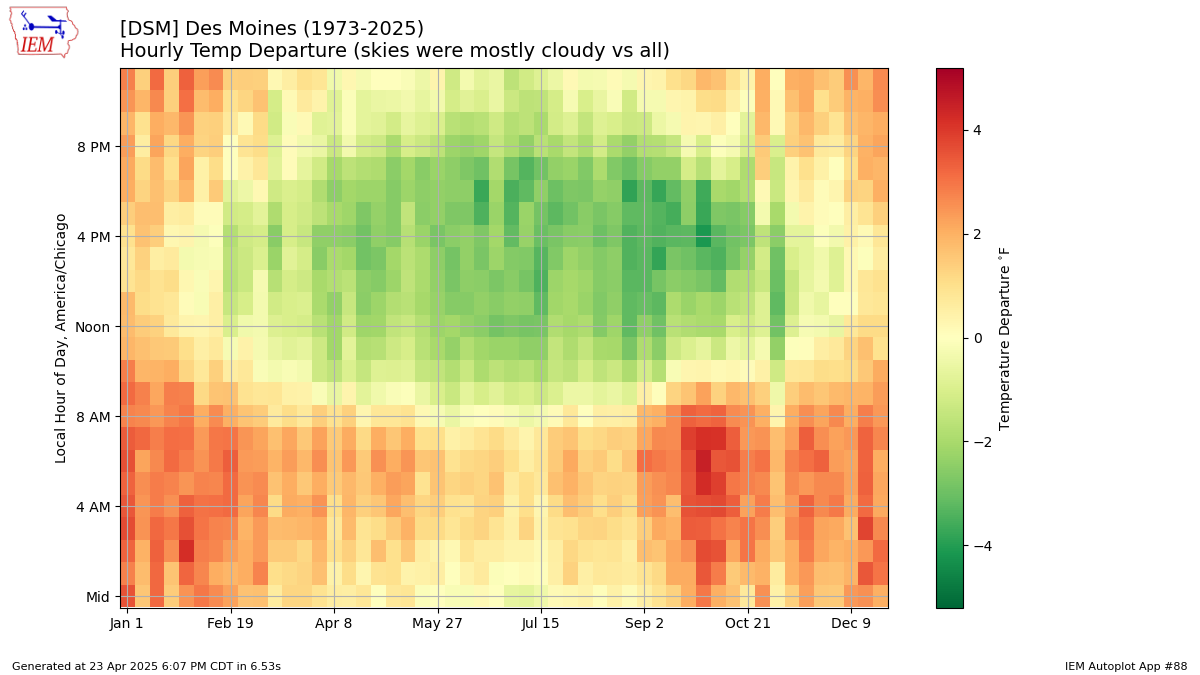
This plot attempts to show the impact of cloudiness on temperatures. The plot shows a simple difference between the average temperature during cloudy/mostly cloudy conditions and the average temperature by hour and by week of the year. The input data for this chart is limited to post 1973 as cloud cover data since then is more reliable/comparable.3 Generated Chart
Based on recent timings, plot generation averages 8 seconds. Please wait while your chart is being generated...
If you notice plotting issues with the image above, please
contact us
and provide the URL address currently shown by your web browser.
IEM Daily Features using this plot
The IEM Daily Features found on this website often utilize plots found on this application. Here is a listing of features referencing this plot type.
- 24 Mar 2025: Temps During Clear Skies
- 23 Jun 2022: Clear Skies Impact on Temps
- 12 Oct 2020: Clouds influencing temperature
- 17 Dec 2018: Clear Skies and Temps
- 25 May 2017: Opposite Effect
- 20 Jul 2015: Clouds and Temps
- 08 Nov 2012: Clouds and Temperature