Automated Data Plotter
This application dynamically generates many types of graphs derived from various IEM data sources. Feel free to use these generated graphics in whatever way you wish.
1 Select a Chart Type
2 Configure Chart Options
Plot Description:
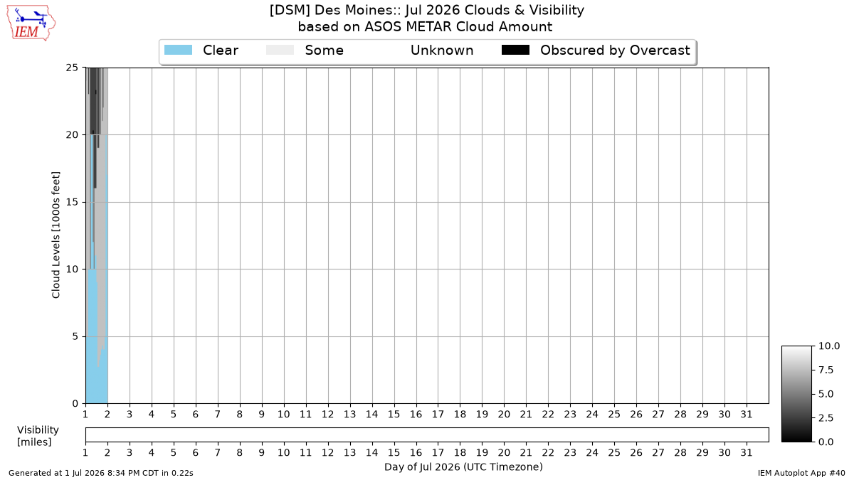
This chart is an attempted illustration of the amount of cloudiness that existed at a METAR site for a given month. The chart combines reports of cloud amount and level to provide a visual representation of the cloudiness. Once the METAR site hits a cloud level of overcast, it can no longer sense clouds above that level. So while the chart will indicate cloudiness up to the top, it may not have been like that in reality.3 Generated Chart
Based on recent timings, plot generation averages 2 seconds. Please wait while your chart is being generated...
If you notice plotting issues with the image above, please
contact us
and provide the URL address currently shown by your web browser.
IEM Daily Features using this plot
The IEM Daily Features found on this website often utilize plots found on this application. Here is a listing of features referencing this plot type.
- 15 Oct 2025: Recent Cloudiness and Visibility
- 29 Jan 2024: Awaiting Sunshine
- 09 Jan 2023: Fog and Clear Skies?
- 15 Jul 2022: July Clouds and Visibilities
- 01 Mar 2021: February Clouds + Vis
- 30 Jan 2020: Recency Bias
- 30 Apr 2019: April Clouds + Visibility
- 21 May 2018: May Clouds
- 31 Jan 2017: January Clouds
- 29 Jun 2016: Plenty of June Sunshine
- 09 Apr 2015: April Clouds
- 11 Dec 2014: Clouds this December