Automated Data Plotter
This application dynamically generates many types of graphs derived from various IEM data sources. Feel free to use these generated graphics in whatever way you wish.
1 Select a Chart Type
2 Configure Chart Options
Plot Description:
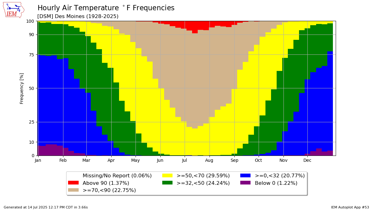
Based on hourly observations, this plot displays the frequency of a given variable falling within a set of thresholds. The thresholds are defined by the user and must be in ascending order. The plot is broken down by week of the year. There is an option to control how hours are handled that do not have the given variable reported. This gets thorny with non-continuously monitored / reported variables like wind gust. If you turn that setting off, the weekly totals will add to 100%, but you should not assume that all hours are accounted for or that it represents a true frequency of time.3 Generated Chart
Based on recent timings, plot generation averages 4 seconds. Please wait while your chart is being generated...
If you notice plotting issues with the image above, please
contact us
and provide the URL address currently shown by your web browser.
IEM Daily Features using this plot
The IEM Daily Features found on this website often utilize plots found on this application. Here is a listing of features referencing this plot type.
- 19 Dec 2024: MSLP Frequencies
- 15 Mar 2023: Temperature within Ranges
- 28 Jun 2021: Hourly Temp Frequencies
- 17 Dec 2019: 90s and Below Zero
- 30 May 2018: 90s in May are rare
- 05 Aug 2016: Hourly Dew Point Frequencies
- 14 Jan 2015: Temperature bins