Automated Data Plotter
This application dynamically generates many types of graphs derived from various IEM data sources. Feel free to use these generated graphics in whatever way you wish.
1 Select a Chart Type
2 Configure Chart Options
Plot Description:
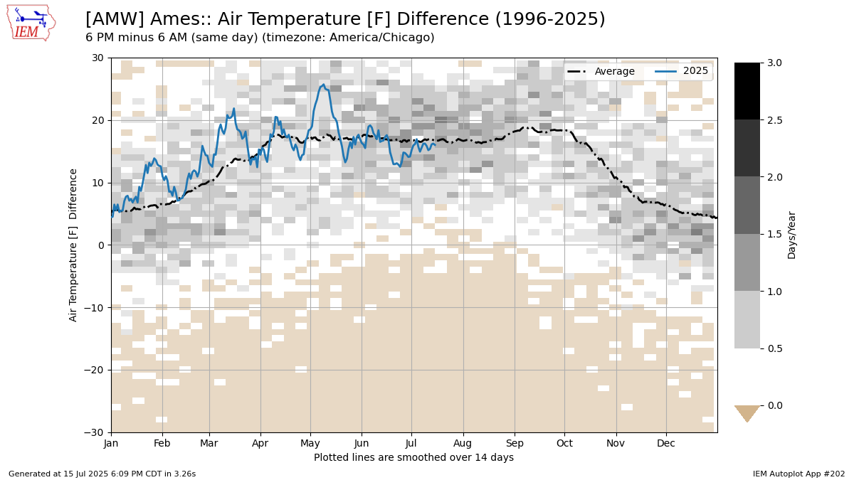
This application presents daily comparisons of an automation station's hourly data. You pick two hours of your choice and the application will compute the difference between the two. The hours selected are for the local time zone of the station. The comparison is made between the first hour and the subsequent second hour. If the first hour is less than the second, the comparison is made on the same calendar day. If the second hour is less than the first, then the second hour is taken from the next day.The chart displays a two dimensional histogram / heatmap underneath the plotted lines covering the period of record data.
3 Generated Chart
Based on recent timings, plot generation averages 6 seconds. Please wait while your chart is being generated...
If you notice plotting issues with the image above, please
contact us
and provide the URL address currently shown by your web browser.
IEM Daily Features using this plot
The IEM Daily Features found on this website often utilize plots found on this application. Here is a listing of features referencing this plot type.
- 30 Jul 2024: Daytime Heating
- 11 Jul 2022: Moisture Change
- 16 Nov 2020: Overnight Cooling
- 26 Apr 2019: Adding Water to Air