Automated Data Plotter
This application dynamically generates many types of graphs derived from various IEM data sources. Feel free to use these generated graphics in whatever way you wish.
1 Select a Chart Type
2 Configure Chart Options
Plot Description:
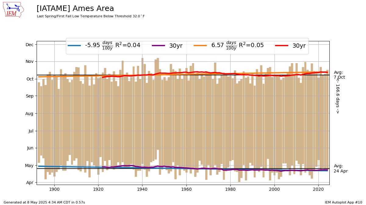
This plot presents the period between the first or last date for spring and fall season that the temperature was above or below some threshold. The year is split into two seasons on 1 July. A simple linear trend line is placed on both dates.3 Generated Chart
Based on recent timings, plot generation averages 2 seconds. Please wait while your chart is being generated...
4 Download Options
If you notice plotting issues with the image above, please
contact us
and provide the URL address currently shown by your web browser.
IEM Daily Features using this plot
The IEM Daily Features found on this website often utilize plots found on this application. Here is a listing of features referencing this plot type.
- 09 Sep 2025: Earliest Sub 37°F Low
- 15 Nov 2023: NCA5: Last Spring Freezes
- 05 Oct 2022: Our last 80?
- 09 Nov 2021: First and Last 65
- 04 Mar 2021: First and Last 60
- 07 Sep 2020: First Sub 55 High
- 19 Mar 2019: Awaiting First 60
- 04 Aug 2017: First Fall Sub 50
- 11 Nov 2016: First and Last 70
- 12 May 2016: First and Last Sub 40
- 09 Oct 2015: First and Last 80
- 07 Nov 2014: Last and First Frozen Day
- 23 Oct 2014: Last 70?
- 03 Oct 2014: First Sub-50 High
- 26 Sep 2014: 80 Degree Period
- 15 Nov 2012: Snow free period